
Redesigning a beloved Dhaka doughnut brand to feel as good as it tastes — and be remembered for it.
Industry
Food & Beverage
Scope
Re-Branding
Duration
8 weeks
Location
Dhaka, Bangladesh
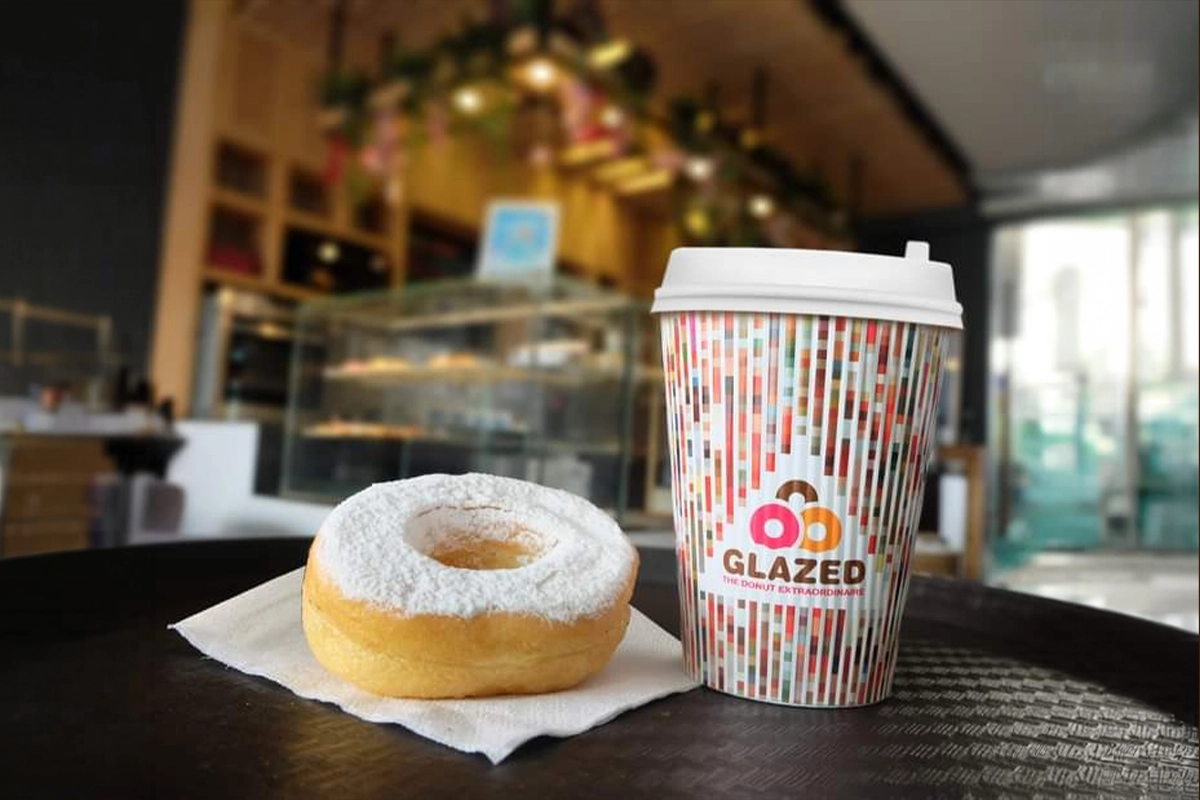
Introduction
Glazed is Dhaka’s first-ever handmade doughnut shop — a brand with seven years of history and a loyal following. But its original logo had aged beyond its purpose. Overloaded with 3D shapes, multi-color gradients, and visual complexity, it no longer reflected the brand’s character. A full identity refresh was overdue.
Challenge
The legacy logo was visually busy — too many competing elements, heavy gradients, and an outdated 3D aesthetic that diluted brand clarity. The core challenge: strip the identity down to its essence while preserving Glazed’s warmth and building a mark that could scale across packaging, digital, and environmental contexts for the next decade.
Approach
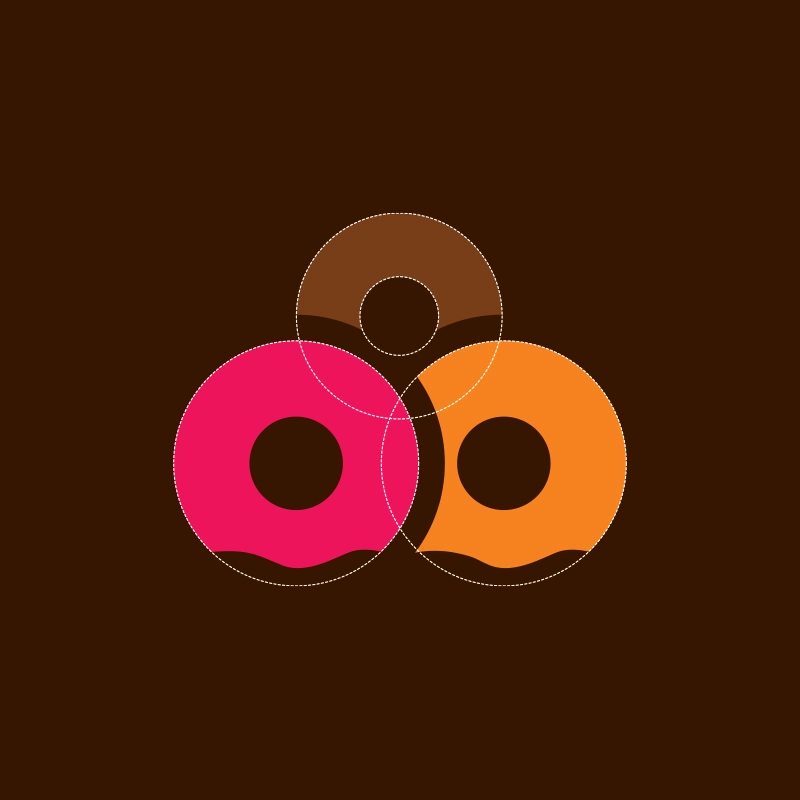
Research revealed Glazed’s three core brand values: smoothness, taste, and youth. Benchmarking world-famous coffee and bakery brands pointed toward the triangle — a shape that signals stability and visual uniqueness in the food industry. However, Glazed demanded something warmer. By rounding the triangle’s corners and pairing it with a soft, humanist typeface, the final mark balances structural confidence with the brand’s playful, handcrafted spirit. Multiple drafts and shape exercises refined the concept before arriving at the definitive direction.
Services
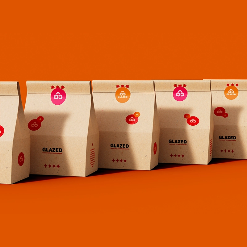
A full-spectrum brand engagement covering identity design, packaging, and growth strategy — everything Glazed needed to re-enter the market with a confident, cohesive presence.
- Logo Redesign
- Custom packaging design
- Design system
- Brand Strategy